I’ve shared the tip on how to create a histogram in Excel before. If your chart is perfect with data in PPT, why not create a dynamic animation to make the presentation more intuitively? You do not even need to create a worksheet in advance, and the method is also simple:
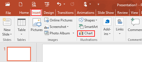
1. Go to Insert tab and click Chart button in IIIustrations group.
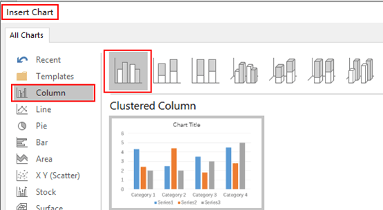
2. The Insert Chart dialog box will display, go to Column tab and click Clustered Column.
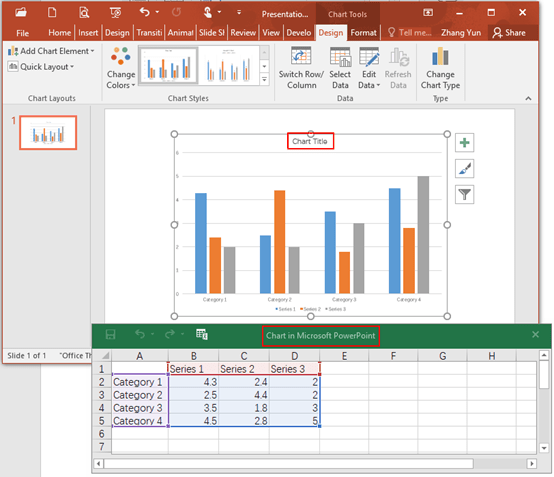
3. The Clustered Column has been created in the slide and the Chart in Microsoft PowerPoint pop-up window will appear, which includes a worksheet with original text and data. Enter your own information there is one thing to note: any information beyond the blue box is invalid and will not be displayed in the Clustered Column.
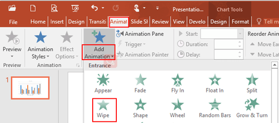
4. Select the Clustered Column and go to Animation tab, click Add Animation and choose Wipe in the drop-down list.
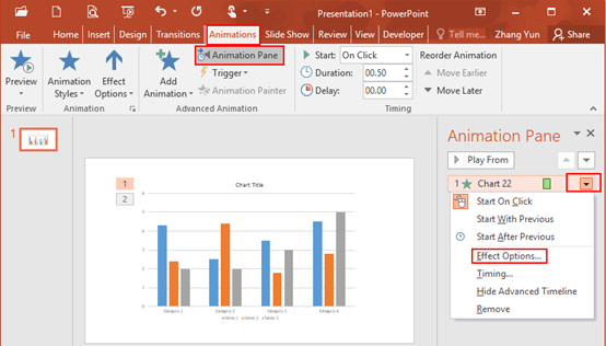
5. Click Animation Pane, click the drop down arrow in the right pane and select Effect Options in the drop-down box.
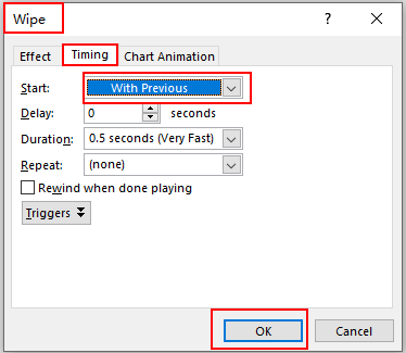
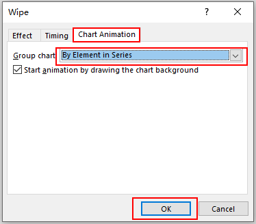
6. The Wipe dialog box will display, go to Timing tab and select With Previous in the box of Start. Then go to Chart Animation tab, select By Element in Series in the box of Group Chart and hit OK at the bottom.
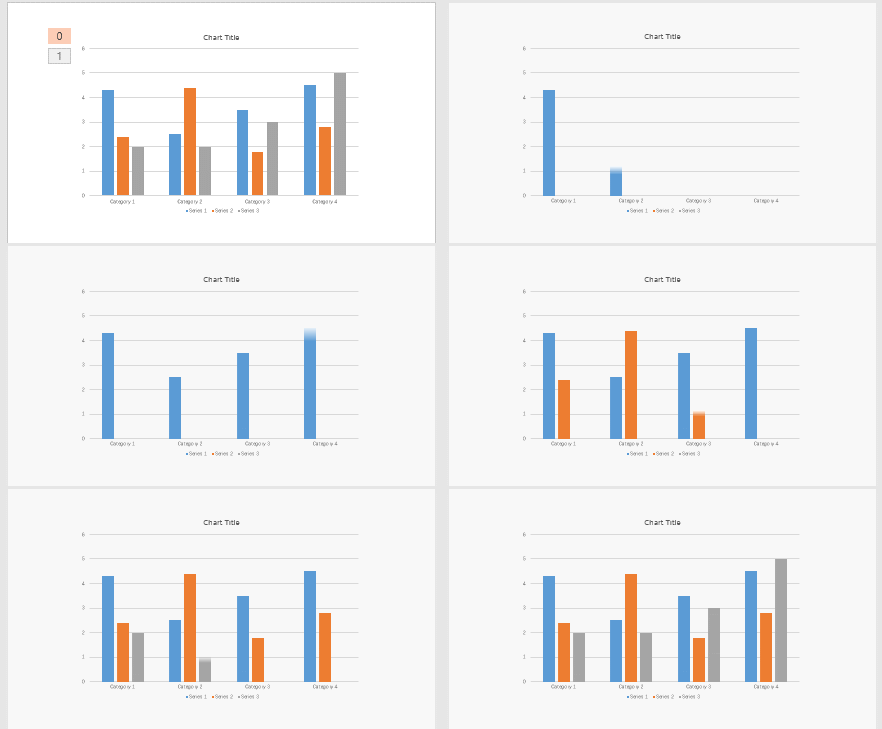
7. Now you have created a dynamic histogram, the final result you can preview as below.

Hmm it looks like your site ate my first comment (it was extremely
long) so I guess I’ll just sum it up what I wrote and say, I’m thoroughly enjoying your blog.
I as well am an aspiring blog writer but I’m still new to
everything. Do you have any tips for newbie blog writers?
I’d really appreciate it.