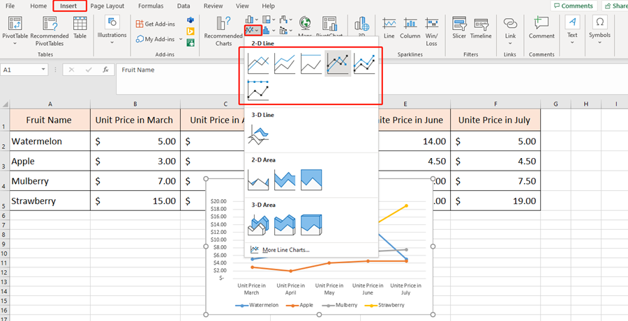
Creating a line chart in Excel is easy. Just select the data area and go to the Insert tab to choose the insert line chart.
There is a worksheet of fruit prices for five months. We can get the line chart.
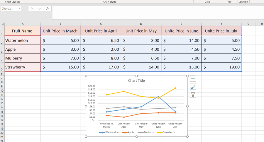
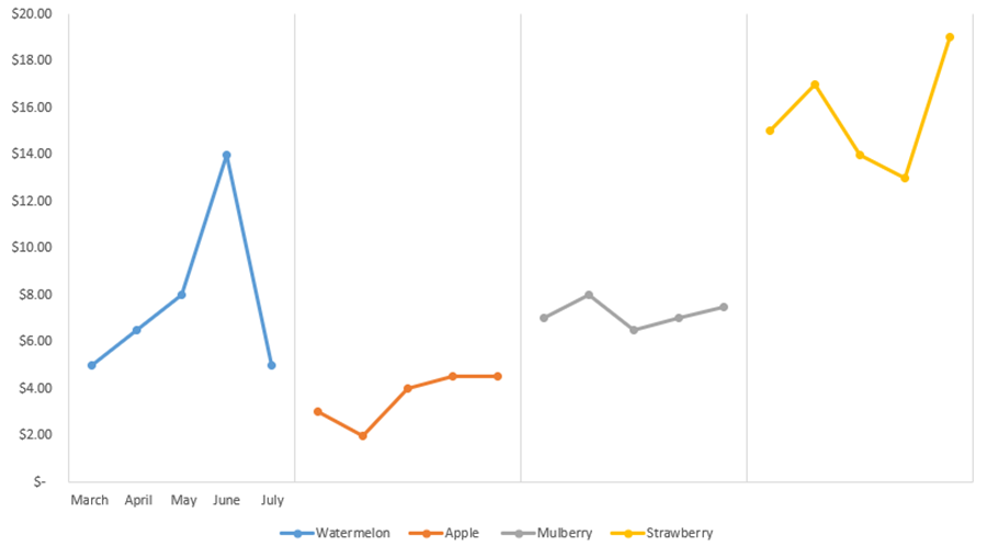
But we are going to learn another kind of line chart to show the price changes of four kinds of fruit in separate line charts.
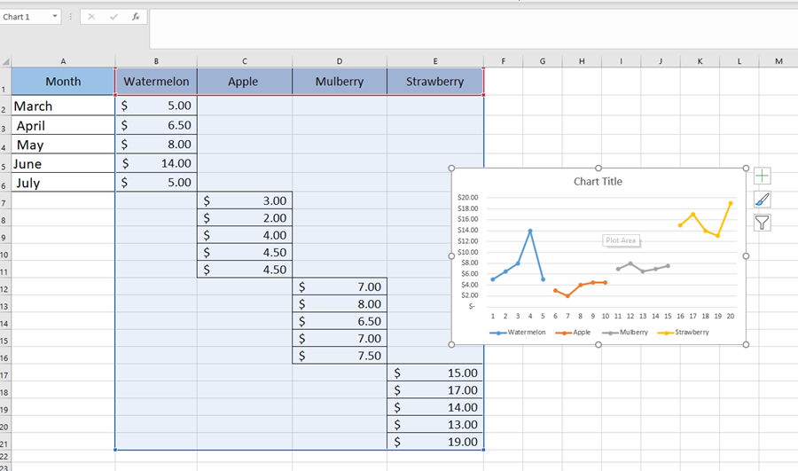
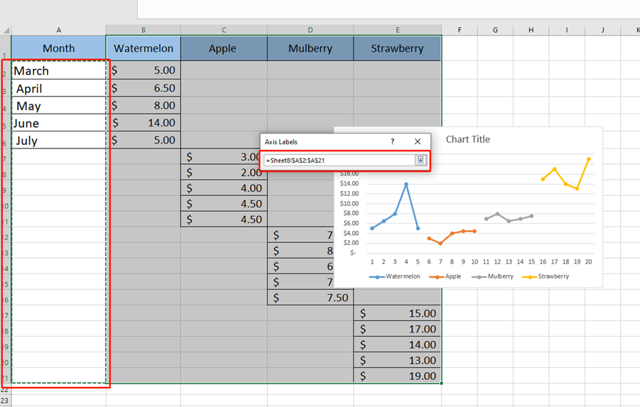
We first need to change our fruit price table from the original to below.

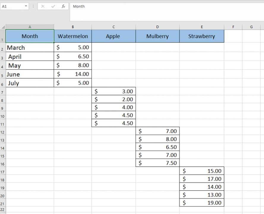
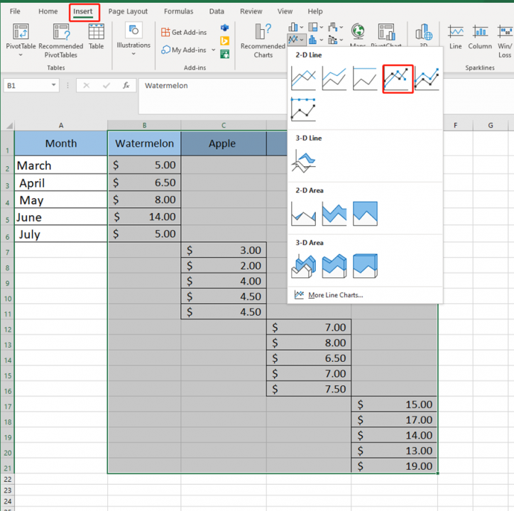
Then we select the area of B1:E21 to insert a line chart with markers.
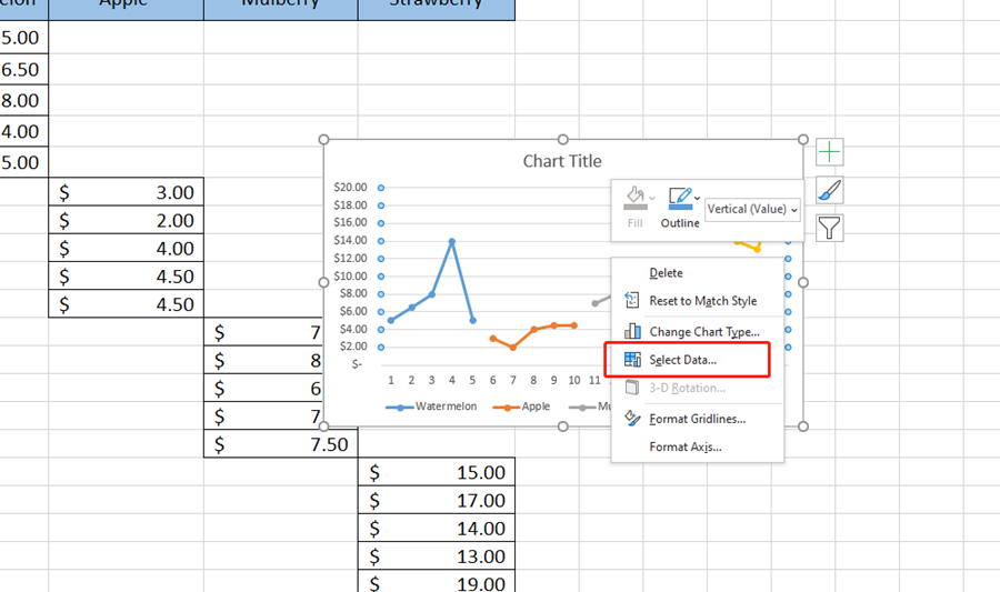
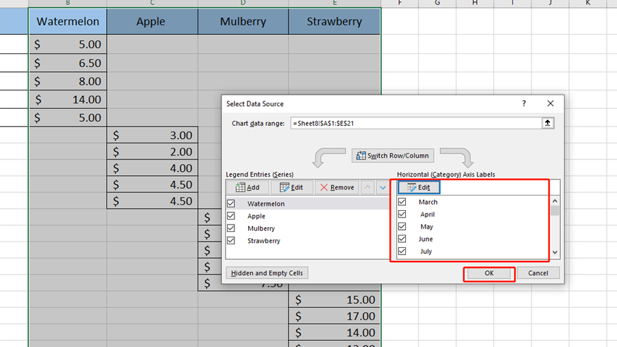
Right click on the chart and choose Select Data Source.
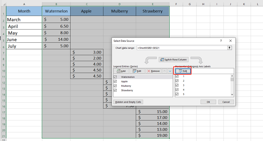
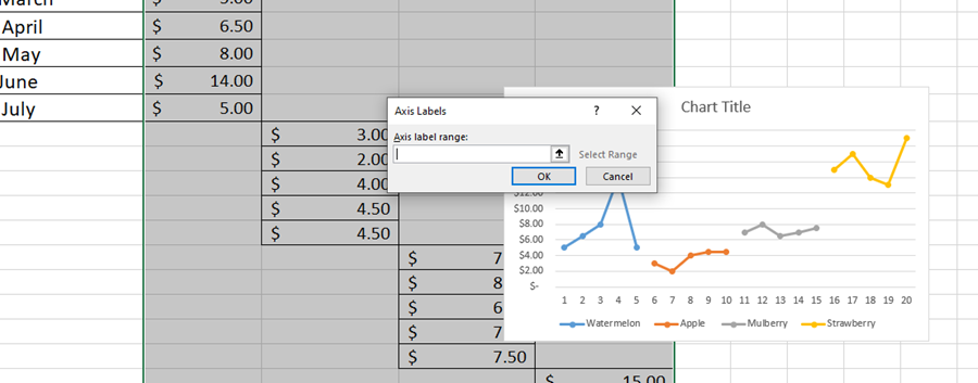
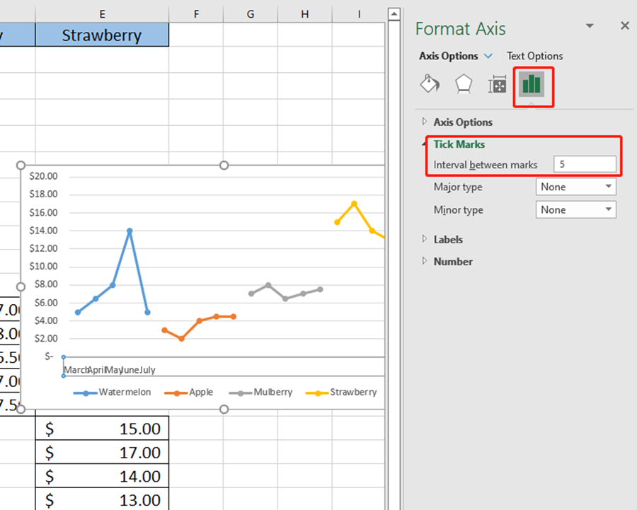
Double-click the chart area and set the interval between marks to 5. Because there are five months.
Then delete gridlines and choose Primary Major Vertical.
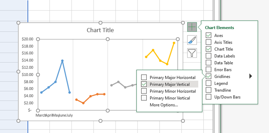
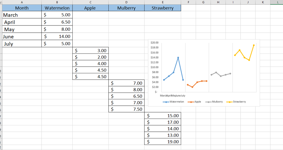
Now we got a different line chart.

Thanks for the explanation. very easy to understand.
My Pleasure