The doughnut chart is a one kind of pie chart. It’s very easy to understand, and you can always see them in news or business report. More important is that doughnut chart is extremely easy to create. Let’s get started.
Basic Table
We need to prepare a basic table first. Take an example like below.
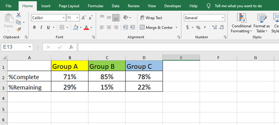
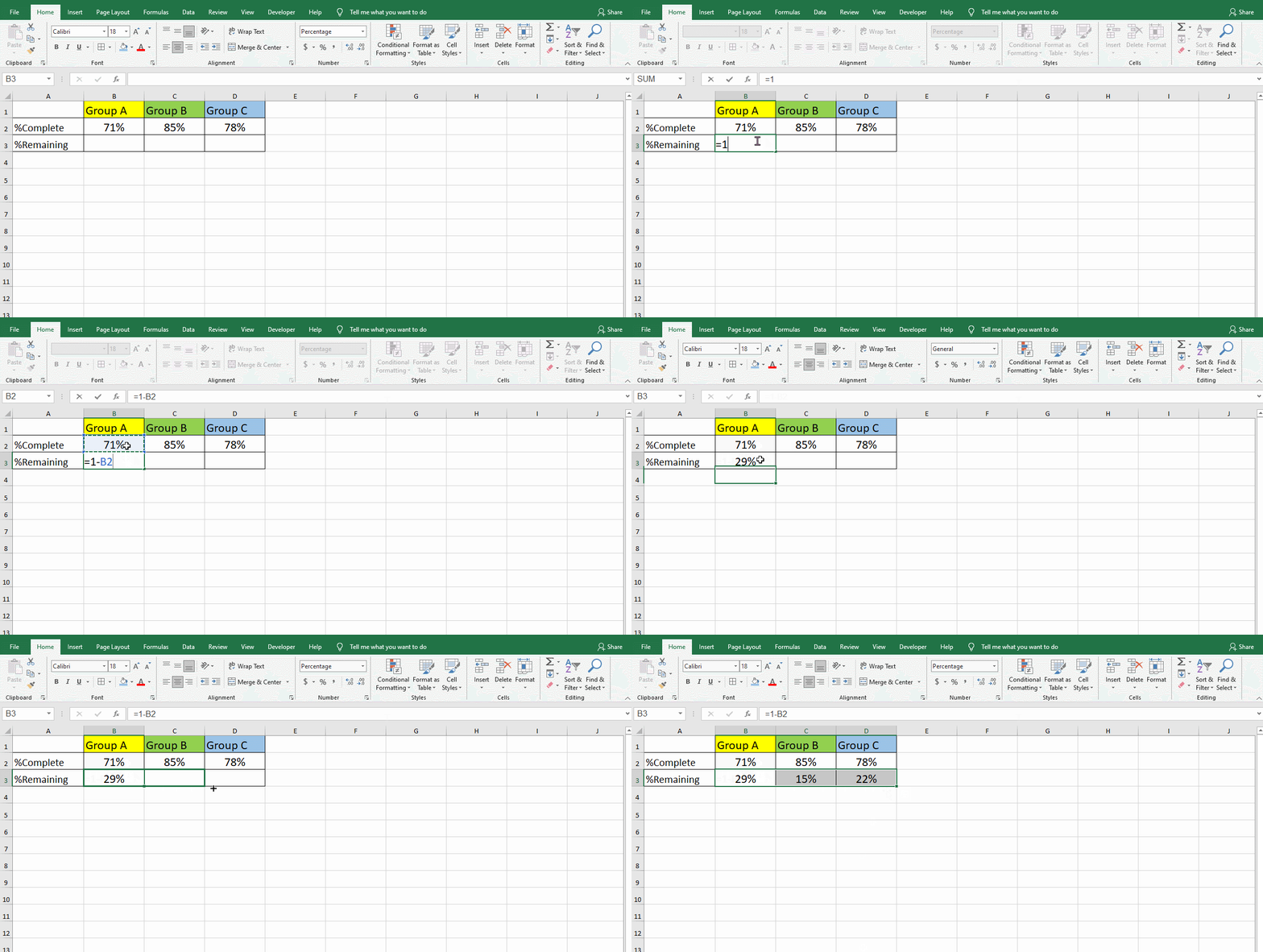
You need to note that the sum of the complete percentage and the remaining percentage of each group is one. Just in case you can type formula =1-B2 in cell B3, the same as C3 and D3.
Insert Chart
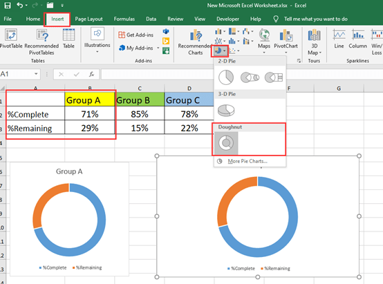
Highlight the table and go to insert to get Doughnut chart quickly.
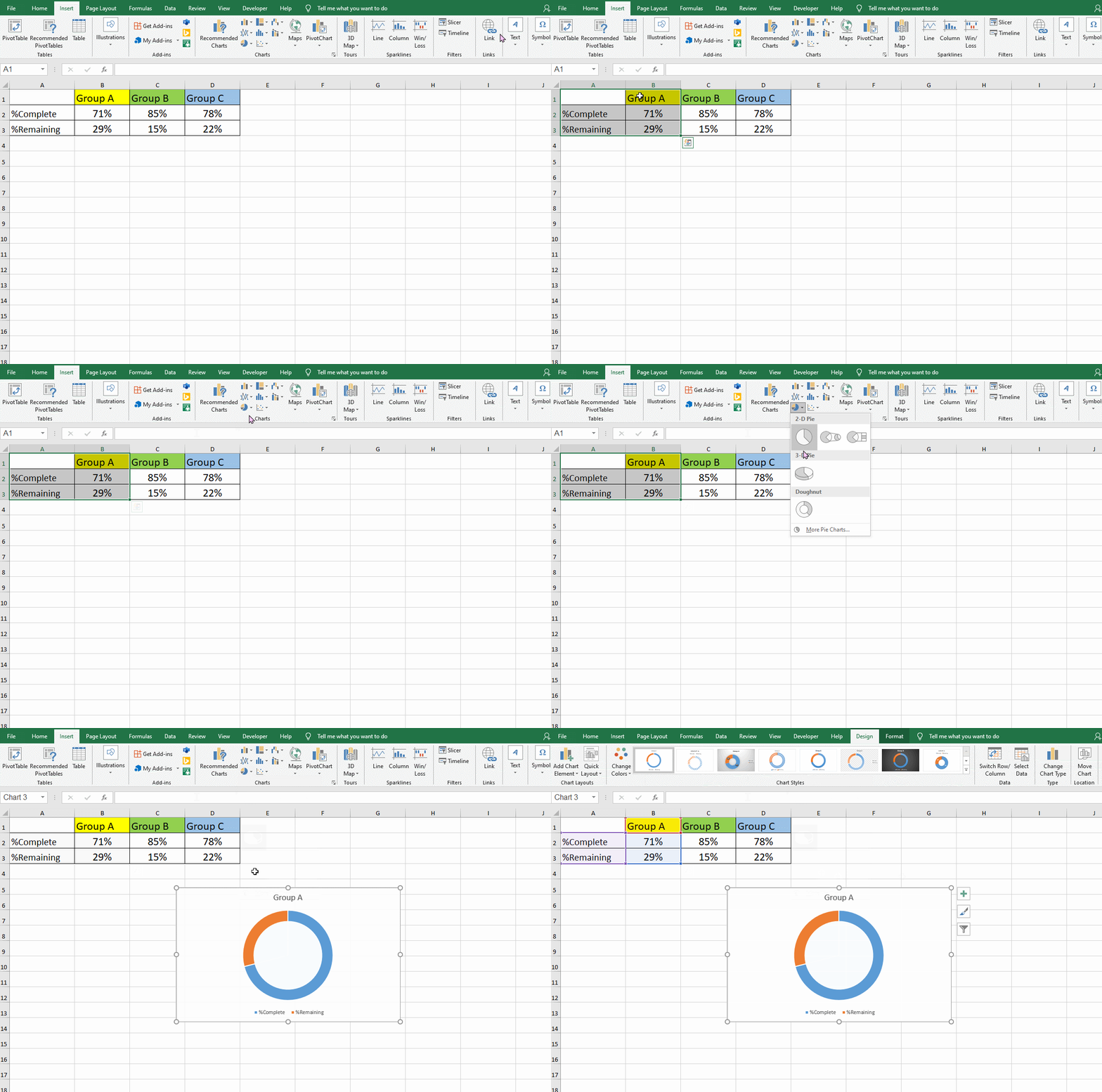
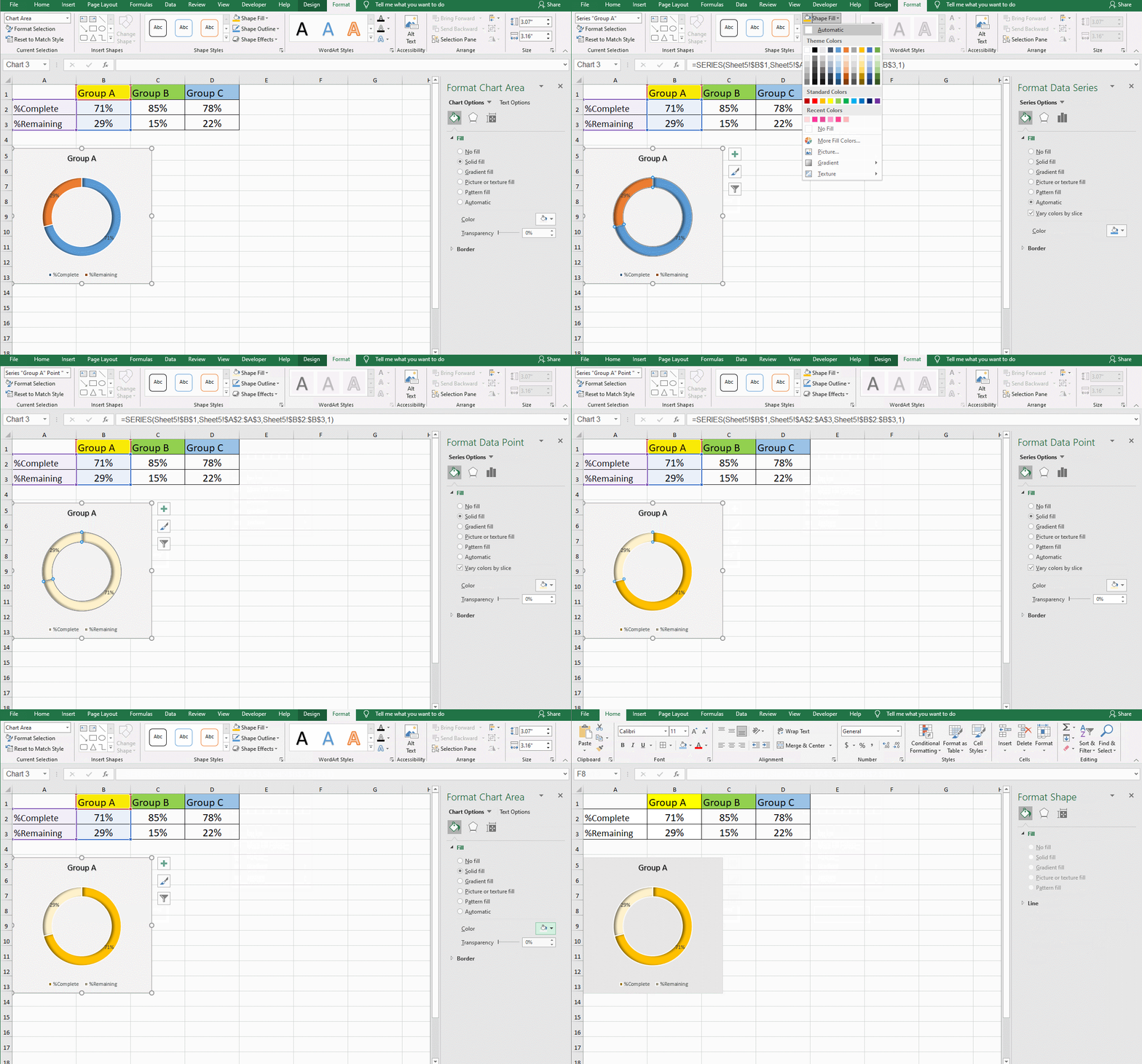
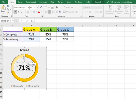
You can adjust the size, color or other effects to make the chart more beautiful.
Complete All the Charts
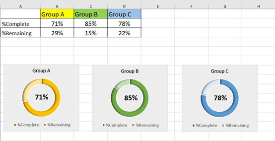
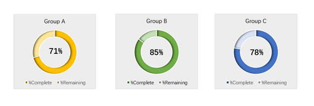
After you finish the first doughnut chart, do the same to the next two. And then you will get three perfect charts.

Leave a Reply