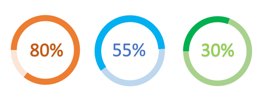
When we are making PPT presentation, we usually use a pie chart to express the proportional relationship between the data in the form of a percentage, so that the audience can intuitively view the proportion of each data. The pie chart is our best choice for explaining percentage data. Have you made the pie chart style in the picture below? The chart looks very different, data is clear at a glance, and it’s also very practical. So let’s make this kind of pie chart in this tutorial.

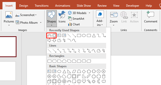
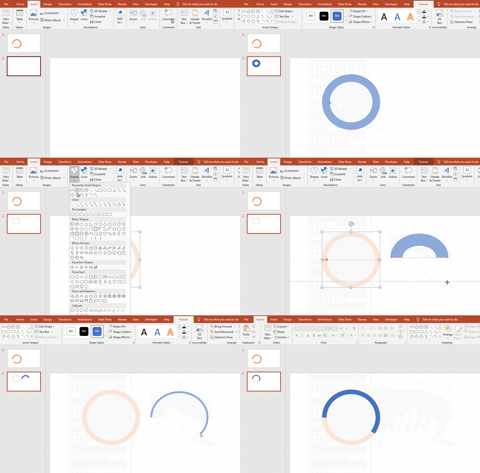
Actually, you can just insert two shapes: block arc and hollow circle, and make them overlap.


You need to adjust color and size. if you want to change the size of block arc. Hold down the left mouse button and click on the orange dot and drag.

Finally, type the text into the pie chart.

Leave a Reply