
Here is a table of seven brand sales from January to June. If we want to clearly see the sales trend of these companies. Inserting sparkline is obsoletely the best way.

Select cell B2, and go to the insert tab to choose Line.

Choose the right Data Range and Location Range, then hit Ok.

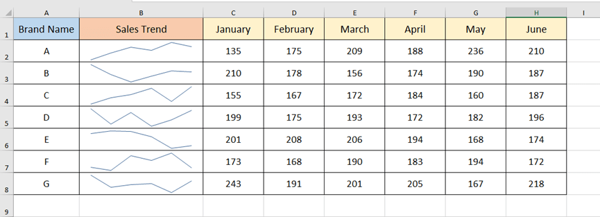
Use the fill handle to fill the list. Now we can clearly see the ups and downs of these companies’ sales.


Leave a Reply